Showing posts with label User Interface. Show all posts

Live wallpapers

With the introduction of live wallpapers in Android 2.1, users can now enjoy richer, animated, interactive backgrounds on their home screen. A live wallpaper is very similar to a normal Android application and has access to all the facilities of the platform: SGL (2D drawing), OpenGL (3D drawing), GPS, accelerometers, network access, etc. The live wallpapers included on Nexus One demonstrate the use of some of these APIs to create fun and interesting user experiences. For instance, the Grass wallpaper uses the phone's location to compute sunrise and sunset times in order to display the appropriate sky.

Creating your own live wallpaper is easy, especially if you have had previous experience with SurfaceView or Canvas. To learn how to create a live wallpaper, you should check out the CubeLiveWallpaper sample provided with the Android 2.1 SDK; you will find it in the directory platforms/android-2.1/samples/CubeLiveWallpaper.

A live wallpaper is very similar to a regular Android service. The only difference is the addition of a new method, onCreateEngine() whose goal is to create a WallpaperService.Engine. The engine is responsible for handling the lifecycle and the drawing of a wallpaper. The system provides you with a surface on which you can draw, just like you would with a SurfaceView. Drawing a wallpaper can be very expensive so you should optimize your code as much as possible to avoid using too much CPU, not only for battery life but also to avoid slowing down the rest of the system. That is also why the most important part of the lifecycle of a wallpaper is when it becomes invisible. When invisible, for instance because the user launched an application that covers the home screen, a wallpaper must stop all activity.

The engine can also implement several methods to interact with the user or the home application. For instance, if you want your wallpaper to scroll along when the user swipes from one home screen to another, you can use onOffsetsChanged(). To react to touch events, simply implement onTouchEvent(MotionEvent). Finally, applications can send arbitrary commands to the live wallpaper. Currently, only the standard home application sends commands to the onCommand() method of the live wallpaper:

  • android.wallpaper.tap: When the user taps an empty space on the workspace. This command is interpreted by the Nexus and Water live wallpapers to make the wallpaper react to user interaction. For instance, if you tap an empty space on the Water live wallpaper, new ripples appear under your finger.
  • android.home.drop: When the user drops an icon or a widget on the workspace. This command is also interpreted by the Nexus and Water live wallpapers.

Please note that live wallpaper is an Android 2.1 feature. To ensure that only users with devices that support this feature can download your live wallpaper, remember to add the following to your manifest before releasing to Android Market:

  • <uses-sdk android:minSdkVersion="7" />, which lets Android Market and the platform know that your application is using the Android 2.1 version.
  • <uses-feature android:name="android.software.live_wallpaper" />, which lets the Android Market and the platform know that your application is a live wallpaper.

Many great live wallpapers are already available on Android Market and we can't wait to see more!

Optimize your layouts


Writing user interface layouts for Android applications is easy, but it can sometimes be difficult to optimize them. Most often, heavy modifications made to existing XML layouts, like shuffling views around or changing the type of a container, lead to inefficiencies that go unnoticed.

Starting with the SDK Tools Revision 3 you can use a tool called layoutopt to automatically detect common problems. This tool is currently only available from the command line and its use is very simple - just open a terminal and launch the layoutopt command with a list of directories or XML files to analyze:


$ layoutopt samples/
samples/compound.xml
7:23 The root-level <FrameLayout/> can be replaced with <merge/>
11:21 This LinearLayout layout or its FrameLayout parent is useless samples/simple.xml
7:7 The root-level <FrameLayout/> can be replaced with <merge/>
samples/too_deep.xml
-1:-1 This layout has too many nested layouts: 13 levels, it should have <= 10!
20:81 This LinearLayout layout or its LinearLayout parent is useless
24:79 This LinearLayout layout or its LinearLayout parent is useless
28:77 This LinearLayout layout or its LinearLayout parent is useless
32:75 This LinearLayout layout or its LinearLayout parent is useless
36:73 This LinearLayout layout or its LinearLayout parent is useless
40:71 This LinearLayout layout or its LinearLayout parent is useless
44:69 This LinearLayout layout or its LinearLayout parent is useless
48:67 This LinearLayout layout or its LinearLayout parent is useless
52:65 This LinearLayout layout or its LinearLayout parent is useless
56:63 This LinearLayout layout or its LinearLayout parent is useless
samples/too_many.xml
7:413 The root-level <FrameLayout/> can be replaced with <merge/>
-1:-1 This layout has too many views: 81 views, it should have <= 80! samples/useless.xml
7:19 The root-level <FrameLayout/> can be replaced with <merge/>
11:17 This LinearLayout layout or its FrameLayout parent is useless
For each analyzed file, the tool will indicate the line numbers of each tag that could potentially be optimized. In some cases, layoutopt will also offer a possible solution.

The current version of layoutopt contains a dozen rules used to analyze your layout files and future versions will contain more. Future plans for this tool also include the ability to create and use your own analysis rules, to automatically modify the layouts with optimized XML, and to use it from within Eclipse and/or a standalone user interface.


Windows users: to start layoutopt, open the file called layoutopt.bat in the tools directory of the SDK and on the last line, replace %jarpath% with -jar %jarpath%.

UI framework changes in Android 1.6

Android 1.6 introduces numerous enhancements and bug fixes in the UI framework. Today, I'd like to highlight three two improvements in particular.

Optimized drawing

The UI toolkit introduced in Android 1.6 is aware of which views are opaque and can use this information to avoid drawing views that the user will not be able to see. Before Android 1.6, the UI toolkit would sometimes perform unnecessary operations by drawing a window background when it was obscured by a full-screen opaque view. A workaround was available to avoid this, but the technique was limited and required work on your part. With Android 1.6, the UI toolkit determines whether a view is opaque by simply querying the opacity of the background drawable. If you know that your view is going to be opaque but that information does not depend on the background drawable, you can simply override the method called isOpaque():

@Override
public boolean isOpaque() {
return true;
}

The value returned by isOpaque() does not have to be constant and can change at any time. For instance, the implementation of ListView in Android 1.6 indicates that a list is opaque only when the user is scrolling it.

Updated: Our apologies—we spoke to soon about isOpaque(). It will be available in a future update to the Android platform.

More flexible, more robust RelativeLayout

RelativeLayout is the most versatile layout offered by the Android UI toolkit and can be successfully used to reduce the number of views created by your applications. This layout used to suffer from various bugs and limitations, sometimes making it difficult to use without having some knowledge of its implementation. To make your life easier, Android 1.6 comes with a revamped RelativeLayout. This new implementation not only fixes all known bugs in RelativeLayout (let us know when you find new ones) but also addresses its major limitation: the fact that views had to be declared in a particular order. Consider the following XML layout:

<?xml version="1.0" encoding="utf-8"?>

<RelativeLayout xmlns:android="http://schemas.android.com/apk/res/android"
android:layout_width="fill_parent"
android:layout_height="64dip"
android:padding="6dip">

<TextView
android:id="@+id/band"
android:layout_width="fill_parent"
android:layout_height="26dip"

android:layout_below="@+id/track"
android:layout_alignLeft="@id/track"
android:layout_alignParentBottom="true"

android:gravity="top"
android:text="The Airborne Toxic Event" />

<TextView
android:id="@id/track"
android:layout_marginLeft="6dip"
android:layout_width="fill_parent"
android:layout_height="26dip"

android:layout_toRightOf="@+id/artwork"

android:textAppearance="?android:attr/textAppearanceMedium"
android:gravity="bottom"
android:text="Sometime Around Midnight" />

<ImageView
android:id="@id/artwork"
android:layout_width="56dip"
android:layout_height="56dip"
android:layout_gravity="center_vertical"

android:src="@drawable/artwork" />

</RelativeLayout>

This code builds a very simple layout—an image on the left with two lines of text stacked vertically. This XML layout is perfectly fine and contains no errors. Unfortunately, Android 1.5's RelativeLayout is incapable of rendering it correctly, as shown in the screenshot below.

The problem is that this layout uses forward references. For instance, the "band" TextView is positioned below the "track" TextView but "track" is declared after "band" and, in Android 1.5, RelativeLayout does not know how to handle this case. Now look at the exact same layout running on Android 1.6:

As you can see Android 1.6 is now better able to handle forward reference. The result on screen is exactly what you would expect when writing the layout.

Easier click listeners

Setting up a click listener on a button is very common task, but it requires quite a bit of boilerplate code:

findViewById(R.id.myButton).setOnClickListener(new View.OnClickListener() {
public void onClick(View v) {
// Do stuff
}
});

One way to reduce the amount of boilerplate is to share a single click listener between several buttons. While this technique reduces the number of classes, it still requires a fair amount of code and it still requires giving each button an id in your XML layout file:

View.OnClickListener handler = View.OnClickListener() {
public void onClick(View v) {
switch (v.getId()) {
case R.id.myButton: // doStuff
break;
case R.id.myOtherButton: // doStuff
break;
}
}
}

findViewById(R.id.myButton).setOnClickListener(handler);
findViewById(R.id.myOtherButton).setOnClickListener(handler);

With Android 1.6, none of this is necessary. All you have to do is declare a public method in your Activity to handle the click (the method must have one View argument):

class MyActivity extends Activity {
public void myClickHandler(View target) {
// Do stuff
}
}

And then reference this method from your XML layout:

<Button android:onClick="myClickHandler" />

This new feature reduces both the amount of Java and XML you have to write, leaving you more time to concentrate on your application.

The Android team is committed to helping you write applications in the easiest and most efficient way possible. We hope you find these improvements useful and we're excited to see your applications on Android Market.

Activities and Tasks Design Guidelines

For our third post in the series of Android UI, we're releasing Activity and Task Design Guidelines. This section of our guidelines aims to help you understand basic concepts of activities and tasks, how they work, and how to enrich the user experience you are creating.

We've packed a lot into this section, which is targeted at designers and developers. You'll see examples that will illustrate how to use our core principles and mechanisms, such as multitasking, activity reuse, intents, and the back stack.

Additionally, we are providing some best practices around our UI patterns such as notifications. For example, we'll show you how to design a notification so that it will take the user to the screen they expect. This behavior needs to be thought out, and doesn't necessarily just happen by default.

With helpful pointers to the API's and this documentation, we look forward to building your understanding of what it means to design and develop an Android UI.

Painless threading

Whenever you first start an Android application, a thread called "main" is automatically created. The main thread, also called the UI thread, is very important because it is in charge of dispatching the events to the appropriate widgets and this includes the drawing events. It is also the thread you interact with Android widgets on. For instance, if you touch the a button on screen, the UI thread dispatches the touch event to the widget which in turn sets its pressed state and posts an invalidate request to the event queue. The UI thread dequeues the request and notifies the widget to redraw itself.

This single thread model can yield poor performance in Android applications that do not consider the implications. Since everything happens on a single thread performing long operations, like network access or database queries, on this thread will block the whole user interface. No event can be dispatched, including drawing events, while the long operation is underway. From the user's perspective, the application appears hung. Even worse, if the UI thread is blocked for more than a few seconds (about 5 seconds currently) the user is presented with the infamous "application not responding" (ANR) dialog.

If you want to see how bad this can look, write a simple application with a button that invokes Thread.sleep(2000) in its OnClickListener. The button will remain in its pressed state for about 2 seconds before going back to its normal state. When this happens, it is very easy for the user to perceive the application as slow.

Now that you know you must avoid lengthy operations on the UI thread, you will probably use extra threads (background or worker threads) to perform these operations, and rightly so. Let's take the example of a click listener downloading an image over the network and displaying it in an ImageView:

public void onClick(View v) {
new Thread(new Runnable() {
public void run() {
Bitmap b = loadImageFromNetwork();
mImageView.setImageBitmap(b);
}
}).start();
}

At first, this code seems to be a good solution to your problem, as it does not block the UI thread. Unfortunately, it violates the single thread model: the Android UI toolkit is not thread-safe and must always be manipulated on the UI thread. In this piece of code, the ImageView is manipulated on a worker thread, which can cause really weird problems. Tracking down and fixing such bugs can be difficult and time-consuming.

Android offers several ways to access the UI thread from other threads. You may already be familiar with some of them but here is a comprehensive list:

Any of these classes and methods could be used to correct our previous code example:

public void onClick(View v) {
new Thread(new Runnable() {
public void run() {
final Bitmap b = loadImageFromNetwork();
mImageView.post(new Runnable() {
public void run() {
mImageView.setImageBitmap(b);
}
});
}
}).start();
}

Unfortunately, these classes and methods also tend to make your code more complicated and more difficult to read. It becomes even worse when your implement complex operations that require frequent UI updates. To remedy this problem, Android 1.5 offers a new utility class, called AsyncTask, that simplifies the creation of long-running tasks that need to communicate with the user interface.

AsyncTask is also available for Android 1.0 and 1.1 under the name UserTask. It offers the exact same API and all you have to do is copy its source code in your application.

The goal of AsyncTask is to take care of thread management for you. Our previous example can easily be rewritten with AsyncTask:

public void onClick(View v) {
new DownloadImageTask().execute("http://example.com/image.png");
}

private class DownloadImageTask extends AsyncTask {
protected Bitmap doInBackground(String... urls) {
return loadImageFromNetwork(urls[0]);
}

protected void onPostExecute(Bitmap result) {
mImageView.setImageBitmap(result);
}
}

As you can see, AsyncTask must be used by subclassing it. It is also very important to remember that an AsyncTask instance has to be created on the UI thread and can be executed only once. You can read the AsyncTask documentation for a full understanding on how to use this class, but here is a quick overview of how it works:

In addition to the official documentation, you can read several complex examples in the source code of Shelves (ShelvesActivity.java and AddBookActivity.java) and Photostream (LoginActivity.java, PhotostreamActivity.java and ViewPhotoActivity.java). I highly recommend reading the source code of Shelves to see how to persist tasks across configuration changes and how to cancel them properly when the activity is destroyed.

Regardless of whether or not you use AsyncTask, always remember these two rules about the single thread model: do not block the UI thread and make sure the Android UI toolkit is only accessed on the UI thread. AsyncTask just makes it easier to do both of these things.

If you want to learn more cool techniques, come join us at Google I/O. Members of the Android team will be there to give a series of in-depth technical sessions and answer all your questions.

Drawable mutations

Android's drawables are extremely useful to easily build applications. A Drawable is a pluggable drawing container that is usually associated with a View. For instance, a BitmapDrawable is used to display images, a ShapeDrawable to draw shapes and gradients, etc. You can even combine them to create complex renderings.

Drawables allow you to easily customize the rendering of the widgets without subclassing them. As a matter of fact, they are so convenient that most of the default Android apps and widgets are built using drawables; there are about 700 drawables used in the core Android framework. Because drawables are used so extensively throughout the system, Android optimizes them when they are loaded from resources. For instance, every time you create a Button, a new drawable is loaded from the framework resources (android.R.drawable.btn_default). This means all buttons across all the apps use a different drawable instance as their background. However, all these drawables share a common state, called the "constant state." The content of this state varies according to the type of drawable you are using, but it usually contains all the properties that can be defined by a resource. In the case of a button, the constant state contains a bitmap image. This way, all buttons across all applications share the same bitmap, which saves a lot of memory.

The following diagram shows what entities are created when you assign the same image resource as the background of two different views. As you can see, two drawables are created but they both share the same constant state, hence the same bitmap:

This state sharing feature is great to avoid wasting memory but it can cause problems when you try to modify the properties of a drawable. Imagine an application with a list of books. Each book has a star next to its name, totally opaque when the user marks the book as a favorite, and translucent when the book is not a favorite. To achieve this effect, you would probably write the following code in your list adapter's getView() method:

Book book = ...;
TextView listItem = ...;

listItem.setText(book.getTitle());

Drawable star = context.getResources().getDrawable(R.drawable.star);
if (book.isFavorite()) {
star.setAlpha(255); // opaque
} else {
star.setAlpha(70); // translucent
}

Unfortunately, this piece of code yields a rather strange result, all the drawables have the same opacity:

This result is explained by the constant state. Even though we are getting a new drawable instance for each list item, the constant state remains the same and, in the case of BitmapDrawable, the opacity is part of the constant state. Thus, changing the opacity of one drawable instance changes the opacity of all the other instances. Even worse, working around this issue was not easy with Android 1.0 and 1.1.

Android 1.5 offers a very way to solve this issue with a the new mutate() method. When you invoke this method on a drawable, the constant state of the drawable is duplicated to allow you to change any property without affecting other drawables. Note that bitmaps are still shared, even after mutating a drawable. The diagram below shows what happens when you invoke mutate() on a drawable:

Let's update our previous piece of code to make use of mutate():

Drawable star = context.getResources().getDrawable(R.drawable.star);
if (book.isFavorite()) {
star.mutate().setAlpha(255); // opaque
} else {
star. mutate().setAlpha(70); // translucent
}

For convenience, mutate() returns the drawable itself, which allows to chain method calls. It does not however create a new drawable instance. With this new piece of code, our application now behaves correctly:

If you want to learn more cool techniques, come join us at Google I/O. Members of the Android team will be there to give a series of in-depth technical sessions and answer all your questions.

Updating Applications for On-screen Input Methods

One of the major new features we are introducing in Android 1.5 is our Input Method Framework (IMF), which allows developers on-screen input methods such as software keyboards. This article will provide an overview of what Android input method editors (IMEs) are, and what an application developer needs to do to work well with them. The IMF allows for a new class of Android devices, such as those without a hardware keyboard, so it is important that your application work well with it to provide the users of such devices a great experience.

What is an input method?

The Android IMF is designed to support a variety of IMEs, including soft keyboard, hand-writing recognizers, and hard keyboard translators. Our focus, however, will be on soft keyboards, since this is the kind of input method that is currently part of the platform.

A user will usually access the current IME by tapping on a text view to edit, as shown here in the home screen:

The soft keyboard is positioned at the bottom of the screen over the application's window. To organize the available space between the application and IME, we use a few approaches; the one shown here is called pan and scan, and simply involves scrolling the application window around so that the currently focused view is visible. This is the default mode, since it is the safest for existing applications.

Most often the preferred screen layout is a resize, where the application's window is resized to be entirely visible. An example is shown here, when composing an e-mail message:

The size of the application window is changed so that none of it is hidden by the IME, allowing full access to both the application and IME. This of course only works for applications that have a resizeable area that can be reduced to make enough space, but the vertical space in this mode is actually no less than what is available in landscape orientation, so very often an application can already accommodate it.

The final major mode is fullscreen or extract mode. This is used when the IME is too large to reasonably share space with the underlying application. With the standard IMEs, you will only encounter this situation when the screen is in a landscape orientation, although other IMEs are free to use it whenever they desire. In this case the application window is left as-is, and the IME simply displays fullscreen on top of it, as shown here:

Because the IME is covering the application, it has its own editing area, which shows the text actually contained in the application. There are also some limited opportunities the application has to customize parts of the IME (the "done" button at the top and enter key label at the bottom) to improve the user experience.

Basic XML attributes for controlling IMEs

There are a number of things the system does to try to help existing applications work with IMEs as well as possible, such as:

  • Use pan and scan mode by default, unless it can reasonably guess that resize mode will work by the existence of lists, scroll views, etc.
  • Analyze the various existing TextView attributes to guess at the kind of content (numbers, plain text, etc) to help the soft keyboard display an appropriate key layout.
  • Assign a few default actions to the fullscreen IME, such as "next field" and "done".

There are also some simple things you can do in your application that will often greatly improve its user experience. Note that, except where explicitly mentioned, all of the things suggested here will not tie your application to Android 1.5 -- it will still work on older releases, which will simply ignore these new options.

Specifying each EditText control's input type

The most important thing for an application to do is use the new android:inputType attribute on each EditText, which provides much richer information about the text content. This attribute actually replaces many existing attributes (android:password, android:singleLine, android:numeric, android:phoneNumber, android:capitalize, android:autoText, android:editable); if you specify both, Cupcake devices will use the new android:inputType attribute and ignore the others.

The input type attribute has three pieces:

  • The class is the overall interpretation of characters. The currently supported classes are text (plain text), number (decimal number), phone (phone number), and datetime (a date or time).
  • The variation is a further refinement on the class. In the attribute you will normally specify the class and variant together, with the class as a prefix. For example, textEmailAddress is a text field where the user will enter something that is an e-mail address (foo@bar.com) so the key layout will have an '@' character in easy access, and numberSigned is a numeric field with a sign. If only the class is specified, then you get the default/generic variant.
  • Additional flags can be specified that supply further refinement. These flags are specific to a class. For example, some flags for the text class are textCapSentences, textAutoCorrect, and textMultiline.

As an example, here is the new EditText for the IM application's message text view:

    <EditText android:id="@+id/edtInput"
android:layout_width="0dip"
android:layout_height="wrap_content"
android:layout_weight="1"
android:inputType="textShortMessage|textAutoCorrect|textCapSentences|textMultiLine"
android:imeOptions="actionSend|flagNoEnterAction"
android:maxLines="4"
android:maxLength="2000"
android:hint="@string/compose_hint"/>

A full description of all of the input types can be found in the documentation. It is important to make use of the correct input types that are available, so that the soft keyboard can use the optimal keyboard layout for the text the user will be entering.

Enabling resize mode and other window features

The next most important thing for you to do is specify the overall behavior of your window in relation to the input method. The most visible aspect of this is controlling resize vs. pan and scan mode, but there are other things you can do as well to improve your user experience.

You will usually control this behavior through the android:windowSoftInputMode attribute on each <activity> definition in your AndroidManifest.xml. Like the input type, there are a couple different pieces of data that can be specified here by combining them together:

  • The window adjustment mode is specified with either adjustResize or adjustPan. It is highly recommended that you always specify one or the other.
  • You can further control whether the IME will be shown automatically when your activity is displayed and other situations where the user moves to it. The system won't automatically show an IME by default, but in some cases it can be convenient for the user if an application enables this behavior. You can request this with stateVisible. There are also a number of other state options for finer-grained control that you can find in the documentation.

A typical example of this field can be see in the edit contact activity, which ensures it is resized and automatically displays the IME for the user:

    <activity name="EditContactActivity"
android:windowSoftInputMode="stateVisible|adjustResize">
...
</activity>

For non-activity windows, there is a new Window.setSoftInputMode() method that can be used to control their behavior. Note that calling this API will make your application incompatible with previous Android platforms.

Controlling the action buttons

The final customization we will look at is the "action" buttons in the IME. There are currently two types of actions:

  • The enter key on a soft keyboard is typically bound to an action when not operating on a mult-line edit text. For example, on the G1 pressing the hard enter key will typically move to the next field or the application will intercept it to execute an action; with a soft keyboard, this overloading of the enter key remains, since the enter button just sends an enter key event.
  • When in fullscreen mode, an IME may also put an additional action button to the right of the text being edited, giving the user quick access to a common application operation.

These options are controlled with the android:imeOptions attribute on TextView. The value you supply here can be any combination of:

  • One of the pre-defined action constants (actionGo, actionSearch, actionSend, actionNext, actionDone). If none of these are specified, the system will infer either actionNext or actionDone depending on whether there is a focusable field after this one; you can explicitly force no action with actionNone.
  • The flagNoEnterAction option tells the IME that the action should not be available on the enter key, even if the text itself is not multi-line. This avoids having unrecoverable actions like (send) that can be accidentally touched by the user while typing.
  • The flagNoAccessoryAction removes the action button from the text area, leaving more room for text.
  • The flagNoExtractUi completely removes the text area, allowing the application to be seen behind it.

The previous IM application message view also provides an example of an interesting use of imeOptions, to specify the send action but not let it be shown on the enter key:

 android:imeOptions="actionSend|flagNoEnterAction"

APIs for controlling IMEs

For more advanced control over the IME, there are a variety of new APIs you can use. Unless special care is taken (such as by using reflection), using these APIs will cause your application to be incompatible with previous versions of Android, and you should make sure you specify android:minSdkVersion="3" in your manifest.

The primary API is the new android.view.inputmethod.InputMethodManager class, which you can retrieve with Context.getSystemService(). It allows you to interact with the global input method state, such as explicitly hiding or showing the current IME's input area.

There are also new window flags controlling input method interaction, which you can control through the existing Window.addFlags() method and new Window.setSoftInputMode() method. The PopupWindow class has grown corresponding methods to control these options on its window. One thing in particular to be aware of is the new WindowManager.LayoutParams.FLAG_ALT_FOCUSABLE_IM constant, which is used to control whether a window is on top of or behind the current IME.

Most of the interaction between an active IME and application is done through the android.view.inputmethod.InputConnection class. This is the API an application implement, which an IME calls to perform the appropriate edit operations on the application. You won't normally need to worry about this, since TextView provides its own implementation for itself.

There are also a handful of new View APIs, the most important of these being onCreateInputConnection() which creates a new InputConnection for an IME (and fills in an android.view.inputmethod.EditorInfo structure with your input type, IME options, and other data); again, most developers won't need to worry about this, since TextView takes care of it for you.


Learn about Android 1.5 and more at Google I/O. Members of the Android team will be there to give a series of in-depth technical sessions and to field your toughest questions.

UI framework changes in Android 1.5

On Monday, we released an early look at the Android 1.5 SDK. Not only does this platform update contain numerous new features, APIs, and bug fixes, but Android 1.5 also brings a new default look for the Android UI framework. After Android 1.0 and 1.1, our designers worked hard to refine and polish the appearance of the system. The screenshots below show the same activity (creating a new contact) on Android 1.1 and Android 1.5:

You can see in this example that the buttons and checkboxes have a new appearance. Even though these changes do not affect binary nor source compatibility, they might still break the UI of your apps. As part of the UI refresh, the minimum size of some of the widgets has changed. For instance, Android 1.1 buttons have a minimum size of 44x48 pixels whereas Android 1.5 buttons now have a minimum size of 24x48 pixels. The image below compares the sizes of Android 1.1 buttons with Android 1.5 buttons:

If you rely on the button's minimum size, then the layout of your application may not be the same in Android 1.5 as it was in Android 1.1 because of this change. This would happen for instance if you created a grid of buttons using LinearLayout and relying on the minimum size yielded by wrap_content to align the buttons properly:

This layout could easily be fixed by using the android:layout_weight attribute or by replacing the LinearLayout containers with a TableLayout.

This example is probably the worst-case UI issue you may encounter when running your application on Android 1.5. Other changes introduced in Android 1.5, especially bug fixes in the layout views, may also impact your application—especially if it is relying on faulty/buggy behavior of the UI framework.

If you encounter issues when running your application on Android 1.5, please join us on the Google groups or IRC so that we and the Android community can help you fix your application.

Happy coding!

Android Layout Tricks #3: Optimize with stubs

Sharing and reusing layouts is very easy with Android thanks to the <include /> tag, sometimes even too easy and you might end up with user interfaces that contain a large number of views, some of which are rarely used. Thankfully, Android offers a very special widget called ViewStub, which brings you all the benefits of the <include /> without polluting your user interface with rarely used views.

A ViewStub is a dumb and lightweight view. It has no dimension, it does not draw anything and does not participate in the layout in any way. This means a ViewStub is very cheap to inflate and very cheap to keep in a view hierarchy. A ViewStub can be best described as a lazy include. The layout referenced by a ViewStub is inflated and added to the user interface only when you decide so.

The following screenshot comes from the Shelves application. The main purpose of the activity shown in the screenshot is to present the user with a browsable list of books:

The same activity is also used when the user adds or imports new books. During such an operation, Shelves shows extra bits of user interface. The screenshot below shows the progress bar and cancel button that appear at the bottom of the screen during an import:

Because importing books is not a common operation, at least when compared to browsing the list of books, the import panel is originally represented by a ViewStub:

When the user initiates the import process, the ViewStub is inflated and replaced by the content of the layout file it references:

To use a ViewStub all you need is to specify an android:id attribute, to later inflate the stub, and an android:layout attribute, to reference what layout file to include and inflate. A stub lets you use a third attribute, android:inflatedId, which can be used to override the id of the root of the included file. Finally, the layout parameters specified on the stub will be applied to the roof of the included layout. Here is an example:

<ViewStub
android:id="@+id/stub_import"
android:inflatedId="@+id/panel_import"

android:layout="@layout/progress_overlay"

android:layout_width="fill_parent"
android:layout_height="wrap_content"
android:layout_gravity="bottom" />

When you are ready to inflate the stub, simply invoke the inflate() method. You can also simply change the visibility of the stub to VISIBLE or INVISIBLE and the stub will inflate. Note however that the inflate() method has the benefit of returning the root View of the inflate layout:

((ViewStub) findViewById(R.id.stub_import)).setVisibility(View.VISIBLE);
// or
View importPanel = ((ViewStub) findViewById(R.id.stub_import)).inflate();

It is very important to remember that after the stub is inflated, the stub is removed from the view hierarchy. As such, it is unnecessary to keep a long-lived reference, for instance in an class instance field, to a ViewStub.

A ViewStub is a great compromise between ease of programming and efficiency. Instead of inflating views manually and adding them at runtime to your view hierarchy, simply use a ViewStub. It's cheap and easy. The only drawback of ViewStub is that it currently does not support the <merge /> tag.

Happy coding!

Window Backgrounds & UI Speed

Some Android applications require to squeeze every bit of performance out of the UI toolkit and there are many ways to do so. In this article, you will discover how to speed up the drawing and the perceived startup time of your activities. Both these techniques rely on a single feature, the window's background drawable.

The term window background is a bit misleading however. When you setup your user interface by calling setContentView() on an Activity, Android adds your views to the Activity's window. The window however does not contain only your views, but a few others created for you. The most important one is, in the current implementation used on the T-Mobile G1, the DecorView, highlighted in the view hierarchy below:

A typical Android view hierarchy

The DecorView is the view that actually holds the window's background drawable. Calling getWindow().setBackgroundDrawable() from your Activity changes the background of the window by changing the DecorView's background drawable. As mentioned before, this setup is very specific to the current implementation of Android and can change in a future version or even on another device.

If you are using the standard Android themes, a default background drawable is set on your activities. The standard theme currently used on the T-Mobile G1 uses for instance a ColorDrawable. For most applications, this background drawable works just fine and can be left alone. It can however impacts your application's drawing performance. Let's take the example of an application that always draws a full screen opaque picture:

An opaque user interface doesn't need a window background

You can see on this screenshot that the window's background is invisible, entirely covered by an ImageView. This application is setup to redraw as fast as it can and draws at about 44 frames per second, or 22 milliseconds per frame (note: the number of frames per second used in this article were obtained on a T-Mobile G1 with my finger on the screen so as to reduce the drawing speed which would otherwise be capped at 60 fps.) An easy way to make such an application draw faster is to remove the background drawable. Since the user interface is entirely opaque, drawing the background is simply wasteful. Removing the background improves the performance quite nicely:

Remove the background for faster drawing

In this new version of the application, the drawing speed went up to 51 frames per second, or 19 milliseconds per frame. The difference of 3 milliseconds per is easily explained by the speed of the memory bus on the T-Mobile G1: it is exactly the time it takes to move the equivalent of a screenful of pixels on the bus. The difference could be even greater if the default background was using a more expensive drawable.

Removing the window's background can be achieved very easily by using a custom theme. To do so, first create a file called res/values/theme.xml containing the following:

<resources>
<style name="Theme.NoBackground" parent="android:Theme">
<item name="android:windowBackground">@null</item>
</style>
</resources>

You then need to apply the theme to your activity by adding the attribute android:theme="@style/Theme.NoBackground" to your <activity /> or <application /> tag. This trick comes in very handy for any app that uses a MapView, a WebView or any other full screen opaque view.

Opaque views and Android: this optimization is currently necessary because the Android UI toolkit is not smart enough to prevent the drawing of views hidden by opaque children. The main reason why this optimization was not implemented is simply because there are usually very few opaque views in Android applications. This is however something that I definitely plan on implementing as soon as possible and I can only apologize for not having been able to do this earlier.

Using a theme to change the window's background is also a fantastic way to improve the perceived startup performance of some of your activities. This particular trick can only be applied to activities that use a custom background, like a texture or a logo. The Shelves application is a good example:

Textured backgrounds are good candidates for window's background

If this application simply set the wooden background in the XML layout or in onCreate() the user would see the application startup with the default theme and its dark background. The wooden texture would only appear after the inflation of the content view and the first layout/drawing pass. This causes a jarring effect and gives the user the impression that the application takes time to load (which can actually be the case.) Instead, the application defines the wooden background in a theme, picked up by the system as soon as the application starts. The user never sees the default theme and gets the impression that the application is up and running right away. To limit the memory and disk usage, the background is a tiled texture defined in res/drawable/background_shelf.xml:

<bitmap xmlns:android="http://schemas.android.com/apk/res/android"
android:src="@drawable/shelf_panel"
android:tileMode="repeat" />

This drawable is simply referenced by the theme:

<resources>
<style name="Theme.Shelves" parent="android:Theme">
<item name="android:windowBackground">@drawable/background_shelf</item>
<item name="android:windowNoTitle">true</item>
</style>
</resources>

The same exact trick is used in the Google Maps application that ships with the T-Mobile G1. When the application is launched, the user immediately sees the loading tiles of MapView. This is only a trick, the theme is simply using a tiled background that looks exactly like the loading tiles of MapView.

Sometimes the best tricks are also the simplest so the next time you create an activity with an opaque UI or a custom background, remember to change the window's background.

Download the source code of the first example.

Download the source code of Shelves.

Android Layout Tricks #3: Optimize by merging

In the previous installment of Android Layout Tricks, I showed you how to use the <include /> tag in XML layout to reuse and share your layout code. I also mentioned the <merge /> and it's now time to learn how to use it.

The <merge /> was created for the purpose of optimizing Android layouts by reducing the number of levels in view trees. It's easier to understand the problem this tag solves by looking at an example. The following XML layout declares a layout that shows an image with its title on top of it. The structure is fairly simple; a FrameLayout is used to stack a TextView on top of an ImageView:

<FrameLayout xmlns:android="http://schemas.android.com/apk/res/android"
android:layout_width="fill_parent"
android:layout_height="fill_parent">

<ImageView
android:layout_width="fill_parent"
android:layout_height="fill_parent"

android:scaleType="center"
android:src="@drawable/golden_gate" />

<TextView
android:layout_width="wrap_content"
android:layout_height="wrap_content"
android:layout_marginBottom="20dip"
android:layout_gravity="center_horizontal|bottom"

android:padding="12dip"

android:background="#AA000000"
android:textColor="#ffffffff"

android:text="Golden Gate" />

</FrameLayout>

This layout renders nicely as we expected and nothing seems wrong with this layout:


A FrameLayout is used to overlay a title on top of an image


Things get more interesting when you inspect the result with HierarchyViewer. If you look closely at the resulting tree you will notice that the FrameLayout defined in our XML file (highlighted in blue below) is the sole child of another FrameLayout:

A layout with only one child of same dimensions can be removed

Since our FrameLayout has the same dimension as its parent, by the virtue of using the fill_parent constraints, and does not define any background, extra padding or a gravity, it is totally useless. We only made the UI more complex for no good reason. But how could we get rid of this FrameLayout? After all, XML documents require a root tag and tags in XML layouts always represent view instances.

That's where the <merge /> tag comes in handy. When the LayoutInflater encounters this tag, it skips it and adds the <merge /> children to the <merge /> parent. Confused? Let's rewrite our previous XML layout by replacing the FrameLayout with <merge />:

<merge xmlns:android="http://schemas.android.com/apk/res/android">

<ImageView
android:layout_width="fill_parent"
android:layout_height="fill_parent"

android:scaleType="center"
android:src="@drawable/golden_gate" />

<TextView
android:layout_width="wrap_content"
android:layout_height="wrap_content"
android:layout_marginBottom="20dip"
android:layout_gravity="center_horizontal|bottom"

android:padding="12dip"

android:background="#AA000000"
android:textColor="#ffffffff"

android:text="Golden Gate" />

</merge>

With this new version, both the TextView and the ImageView will be added directly to the top-level FrameLayout. The result will be visually the same but the view hierarchy is simpler:

Optimized view hierarchy using the merge tag

Obviously, using <merge /> works in this case because the parent of an activity's content view is always a FrameLayout. You could not apply this trick if your layout was using a LinearLayout as its root tag for instance. The <merge /> can be useful in other situations though. For instance, it works perfectly when combined with the <include /> tag. You can also use <merge /> when you create a custom composite view. Let's see how we can use this tag to create a new view called OkCancelBar which simply shows two buttons with customizable labels. You can also download the complete source code of this example. Here is the XML used to display this custom view on top of an image:

<merge
xmlns:android="http://schemas.android.com/apk/res/android"
xmlns:okCancelBar="http://schemas.android.com/apk/res/com.example.android.merge">

<ImageView
android:layout_width="fill_parent"
android:layout_height="fill_parent"

android:scaleType="center"
android:src="@drawable/golden_gate" />

<com.example.android.merge.OkCancelBar
android:layout_width="fill_parent"
android:layout_height="wrap_content"
android:layout_gravity="bottom"

android:paddingTop="8dip"
android:gravity="center_horizontal"

android:background="#AA000000"

okCancelBar:okLabel="Save"
okCancelBar:cancelLabel="Don't save" />

</merge>

This new layout produces the following result on a device:

Creating a custom view with the merge tag

The source code of OkCancelBar is very simple because the two buttons are defined in an external XML file, loaded using a LayoutInflate. As you can see in the following snippet, the XML layout R.layout.okcancelbar is inflated with the OkCancelBar as the parent:

public class OkCancelBar extends LinearLayout {
public OkCancelBar(Context context, AttributeSet attrs) {
super(context, attrs);
setOrientation(HORIZONTAL);
setGravity(Gravity.CENTER);
setWeightSum(1.0f);

LayoutInflater.from(context).inflate(R.layout.okcancelbar, this, true);

TypedArray array = context.obtainStyledAttributes(attrs, R.styleable.OkCancelBar, 0, 0);

String text = array.getString(R.styleable.OkCancelBar_okLabel);
if (text == null) text = "Ok";
((Button) findViewById(R.id.okcancelbar_ok)).setText(text);

text = array.getString(R.styleable.OkCancelBar_cancelLabel);
if (text == null) text = "Cancel";
((Button) findViewById(R.id.okcancelbar_cancel)).setText(text);

array.recycle();
}
}

The two buttons are defined in the following XML layout. As you can see, we use the <merge /> tag to add the two buttons directly to the OkCancelBar. Each button is included from the same external XML layout file to make them easier to maintain; we simply override their id:

<merge xmlns:android="http://schemas.android.com/apk/res/android">
<include
layout="@layout/okcancelbar_button"
android:id="@+id/okcancelbar_ok" />

<include
layout="@layout/okcancelbar_button"
android:id="@+id/okcancelbar_cancel" />
</merge>

We have created a flexible and easy to maintain custom view that generates an efficient view hierarchy:

The resulting hierarchy is simple and efficient

The <merge /> tag is extremely useful and can do wonders in your code. However, it suffers from a couple of limitation:

  • <merge /> can only be used as the root tag of an XML layout

  • When inflating a layout starting with a <merge />, you must specify a parent ViewGroup and you must set attachToRoot to true (see the documentation of the inflate() method)

In the next installment of Android Layout Tricks you will learn about ViewStub, a powerful variation of <include /> that can help you further optimize your layouts without sacrificing features.

Download the complete source code of this example.

Android Layout Tricks #2: Reusing layouts

Android comes with a wide variety of widgets, small visual construction blocks you can glue together to present the users with complex and useful interfaces. However applications often need higher level visual components. A component can be seen as a complex widget made of several simple stock widgets. You could for instance reuse a panel containing a progress bar and a cancel button, a panel containing two buttons (positive and negative actions), a panel with an icon, a title and a description, etc. Creating new components can be done easily by writing a custom View but it can be done even more easily using only XML.

In Android XML layout files, each tag is mapped to an actual class instance (the class is always a subclass of View.) The UI toolkit lets you also use three special tags that are not mapped to a View instance: <requestFocus />, <merge /> and <include />. The latter, <include />, can be used to create pure XML visual components. (Note: I will present the <merge /> tag in the next installment of Android Layout Tricks.)

The <include /> does exactly what its name suggests; it includes another XML layout. Using this tag is straightforward as shown in the following example, taken straight from the source code of the Home application that currently ships with Android:

<com.android.launcher.Workspace
android:id="@+id/workspace"
android:layout_width="fill_parent"
android:layout_height="fill_parent"

launcher:defaultScreen="1">

<include android:id="@+id/cell1" layout="@layout/workspace_screen" />
<include android:id="@+id/cell2" layout="@layout/workspace_screen" />
<include android:id="@+id/cell3" layout="@layout/workspace_screen" />

</com.android.launcher.Workspace>

In the <include /> only the layout attribute is required. This attribute, without the android namespace prefix, is a reference to the layout file you wish to include. In this example, the same layout is included three times in a row. This tag also lets you override a few attributes of the included layout. The above example shows that you can use android:id to specify the id of the root view of the included layout; it will also override the id of the included layout if one is defined. Similarly, you can override all the layout parameters. This means that any android:layout_* attribute can be used with the <include /> tag. Here is an example:

<include android:layout_width="fill_parent" layout="@layout/image_holder" />
<include android:layout_width="256dip" layout="@layout/image_holder" />

This tag is particularly useful when you need to customize only part of your UI depending on the device's configuration. For instance, the main layout of your activity can be placed in the layout/ directory and can include another layout which exists in two flavors, in layout-land/ and layout-port/. This allows you to share most of the UI in portrait and landscape.

Like I mentioned earlier, my next post will explain the <merge />, which can be particularly powerful when combined with <include />.

Android Layout Tricks #1

The Android UI toolkit offers several layout managers that are rather easy to use and, most of the time, you only need the basic features of these layout managers to implement a user interface. Sticking to the basic features is unfortunately not the most efficient way to create user interfaces. A common example is the abuse of LinearLayout, which leads to a proliferation of views in the view hierarchy. Every view, or worse every layout manager, you add to your application comes at a cost: initialization, layout and drawing become slower. The layout pass can be especially expensive when you nest several LinearLayout that use the weight parameter, which requires the child to be measured twice.

Let's consider a very simple and common example of a layout: a list item with an icon on the left, a title at the top and an optional description underneath the title. Here is what such an item looks like:

Simple list item

To clearly understand how the views, one ImageView and two TexView, are positioned with respect to each other, here is the wireframe of the layout as captured by HierarchyViewer:

Wireframe of the simple list item

Implementing this layout is straightforward with LinearLayout. The item itself is a horizontal LinearLayout with an ImageView and a vertical LinearLayout, which contains the two TextViews. The source code of this layout is the following:

<LinearLayout xmlns:android="http://schemas.android.com/apk/res/android"
android:layout_width="fill_parent"
android:layout_height="?android:attr/listPreferredItemHeight"

android:padding="6dip">

<ImageView
android:id="@+id/icon"

android:layout_width="wrap_content"
android:layout_height="fill_parent"
android:layout_marginRight="6dip"

android:src="@drawable/icon" />

<LinearLayout
android:orientation="vertical"

android:layout_width="0dip"
android:layout_weight="1"
android:layout_height="fill_parent">

<TextView
android:layout_width="fill_parent"
android:layout_height="0dip"
android:layout_weight="1"

android:gravity="center_vertical"
android:text="My Application" />

<TextView
android:layout_width="fill_parent"
android:layout_height="0dip"
android:layout_weight="1"

android:singleLine="true"
android:ellipsize="marquee"
android:text="Simple application that shows how to use RelativeLayout" />

</LinearLayout>

</LinearLayout>

This layout works but can be wasteful if you instantiate it for every list item of a ListView. The same layout can be rewritten using a single RelativeLayout, thus saving one view, and even better one level in view hierarchy, per list item. The implementation of the layout with a RelativeLayout remains simple:

<RelativeLayout xmlns:android="http://schemas.android.com/apk/res/android"
android:layout_width="fill_parent"
android:layout_height="?android:attr/listPreferredItemHeight"

android:padding="6dip">

<ImageView
android:id="@+id/icon"

android:layout_width="wrap_content"
android:layout_height="fill_parent"

android:layout_alignParentTop="true"
android:layout_alignParentBottom="true"
android:layout_marginRight="6dip"

android:src="@drawable/icon" />

<TextView
android:id="@+id/secondLine"

android:layout_width="fill_parent"
android:layout_height="26dip"

android:layout_toRightOf="@id/icon"
android:layout_alignParentBottom="true"
android:layout_alignParentRight="true"

android:singleLine="true"
android:ellipsize="marquee"
android:text="Simple application that shows how to use RelativeLayout" />

<TextView
android:layout_width="fill_parent"
android:layout_height="wrap_content"

android:layout_toRightOf="@id/icon"
android:layout_alignParentRight="true"
android:layout_alignParentTop="true"
android:layout_above="@id/secondLine"
android:layout_alignWithParentIfMissing="true"

android:gravity="center_vertical"
android:text="My Application" />

</RelativeLayout>

This new implementation behaves exactly the same way as the previous implementation, except in one case. The list item we want to display has two lines of text: the title and an optional description. When a description is not available for a given list item, the application would simply set the visibility of the second TextView to GONE. This works perfectly with the LinearLayout implementation but not with the RelativeLayout version:

RelativeLayout and description GONE

RelativeLayout and description GONE

In a RelativeLayout, views are aligned either with their parent, the RelativeLayout itself, or other views. For instance, we declared that the description is aligned with the bottom of the RelativeLayout and that the title is positioned above the description and anchored to the parent's top. With the description GONE, RelativeLayout doesn't know where to position the title's bottom edge. To solve this problem, you can use a very special layout parameter called alignWithParentIfMissing.

This boolean parameter simply tells RelativeLayout to use its own edges as anchors when a constraint target is missing. For instance, if you position a view to the right of a GONE view and set alignWithParentIfMissing to true, RelativeLayout will instead anchor the view to its left edge. In our case, using alignWithParentIfMissing will cause RelativeLayout to align the title's bottom with its own bottom. The result is the following:

RelativeLayout, description GONE and alignWithParentIfMissing

The behavior of our layout is now perfect, even when the description is GONE. Even better, the hierarchy is simpler and because we are not using LinearLayout's weights it's also more efficient. The difference between the two implementations becomes obvious when comparing the view hierarchies in HierarchyViewer:

LinearLayout vs RelativeLayout

Again, the difference will be much more important when you use such a layout for every item in a ListView for instance. Hopefully this simple example showed you that getting to know your layouts is the best way to learn how to optimize your UI.

Why is my list black? An Android optimization

ListView is one of Android's most widely used widgets. It is rather easy to use, very flexible and incredibly powerful. ListView can also be difficult to understand at times.


One of the most common issues with ListView happens when you try to use a custom background. By default, like many Android widgets, ListView has a transparent background which means yo can see through the default window's background, a very dark gray (#FF191919 with the current dark theme.) Additionally, ListView enables the fading edges by default, as you can see at the top of the following screenshot; the first text item gradually fades to black. This technique is used throughout the system to indicate that the container can be scrolled.


Android's default ListView

The fade effect is implemented using a combination of Canvas.saveLayerAlpha() and the Porter-Duff Destination Out blending mode. This technique is similar to the one explained in Filthy Rich Clients and various presentations. Unfortunately, things start to get ugly when you try to use a custom background on the ListView or when you change the window's background. The following two screenshots show what happens in an application when you change the window's background. The left image shows what the list looks like by default and the right image shows what the list looks like during a scroll initiated with a touch gesture:


Dark fadeDark list

This rendering issue is caused by an optimization of the Android framework enabled by default on all instances of ListView (for some reason, I forgot to enable it by default on GridView.) I mentioned earlier that the fade effect is implemented using a Porter-Duff blending mode. This implementation works really well but is unfortunately very costly and can bring down drawing performance by quite a bit as it requires to capture a portion of the rendering in an offscreen bitmap and then requires extra blending (which implies readbacks from memory.)


Since ListView is most of the time displayed on a solid background, there is no reason to go down that expensive route. That's why we introduced an optimization called the "cache color hint." The cache color hint is an RGB color set by default to the window's background color, that is #191919 in Android's dark theme. When this hint is set, ListView (actually, its base class View) knows it will draw on a solid background and therefore replaces th expensive saveLayerAlpha()/Porter-Duff rendering with a simple gradient. This gradient goes from fully transparent to the cache color hint value and this is exactly what you see on the image above, with the dark gradient at the bottom of the list. However, this still does not explain why the entire list turns black during a scroll.


As I said before, ListView has a transparent/translucent background by default, and so all default Android widgets. This implies that when ListView redraws its children, it has to blend the children with the window's background. Once again, this requires costly readbacks from memory that are particularly painful during a scroll or a fling when drawing happens dozen of times per second. To improve drawing performance during scrolling operations, the Android framework reuses the cache color hint. When this hint is set, the framework copies each child of the list in a Bitmap filled with the hint value (this assumes that another optimization, called scrolling cache, is not turned off.) ListView then blits these bitmaps directly on screen and because these bitmaps are known to be opaque, no blending is required. And since the default cache color hint is #191919, you get a dark background behind each item during a scroll.


To fix this issue, all you have to do is either disable the cache color hint optimization, if you use a non-solid color background, or set the hint to the appropriate solid color value. This can be dome from code or preferably from XML, by using the android:cacheColorHint attribute. To disable the optimization, simply use the transparent color #00000000. The following screenshot shows a list with android:cacheColorHint="#00000000" set in the XML layout file:


Fade on a custom background

As you can see, the fade works perfectly against the custom wooden background. I find the cache color hint feature interesting because it shows how optimizations can make developers' life more difficult in some situations. In this particular case, however, the benefit of the default behavior outweighs the added complexity for the developer.


Note: this article was originally posted on my personal blog.

Touch Mode

Designing and developing user interfaces for Android is very different from doing so in a regular desktop environment. Because Android runs applications on mobile devices, application designers and developers must deal with numerous constraints that are not always obvious. To help you design and develop better applications, we are publishing a new series of posts focusing on Android user interfaces. In this series, we will give you design guides and tools, development tips, and explain the fundamental principles of the Android UI toolkit. The goal here is simple: we want to help you design and develop a great user experience. To start off this series, I'd like to introduce touch mode, one of the most important principles of the UI toolkit.

The touch mode is a state of the view hierarchy that depends solely on the user interaction with the phone. By itself, the touch mode is something very easy to understand as it simply indicates whether the last user interaction was performed with the touch screen. For example, if you are using a G1 phone, selecting a widget with the trackball will take you out of touch mode; however, if you touch a button on the screen with your finger, you will enter touch mode. When the user is not in touch mode, we talk about the trackball mode, navigation mode or keyboard navigation, so do not be surprised if you encounter these terms. Finally, there is only one API directly related to touch mode, View.isInTouchMode().

Sounds easy enough right? Oddly enough, touch mode is deceivingly simple and the consequences of entering touch mode are far greater than you might think. Let's look at some of the reasons why.

Touch Mode, Selection, and Focus

Designing a UI toolkit for mobile devices is difficult because of the various interaction mechanisms they provide. Some devices offer only 12 keys, some have a touch screen, some require a stylus, some have both a touch screen and a keyboard. In that regard, it is a great benefit for the Android development community that the first commercially available device, the G1, offers multiple forms of input using a touch screen, a trackball, and a keyboard. Because the user can interact with applications using three different mechanisms, we had to think very hard about all the possible issues that could arise. One issue led us to create the touch mode.

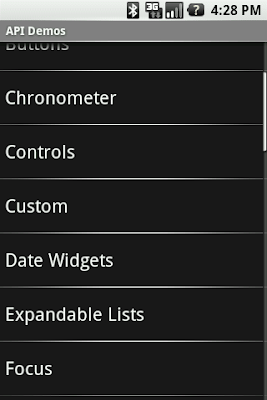
Imagine a simple application, ApiDemos for example, that shows a list of text items. The user can freely navigate through the list using the trackball and they can also scroll and fling the list using their finger. The issue in this scenario is the selection. If I select an item at the top of the list and then fling the list towards the bottom, what should happen to the selection? Should it remain on the item and scroll off the screen? In this case, what would happen if I then decide to move the selection with the trackball? Or worse, if I press the trackball to act upon the currently selected item, which is not shown on screen anymore. After careful considerations, we decided to remove the selection altogether.

In touch mode, there is no focus and no selection. Any selected item in a list of in a grid becomes unselected as soon as the user enters touch mode. Similarly, any focused widgets become unfocused when the user enters touch mode. The image below illustrates what happens when the user touches a list after selecting an item with the trackball.

To make things more natural for the user, the framework knows how to resurrect the selection/focus whenever the user leaves touch mode. For instance, in the example above, if the user were to use the trackball again, the selection would reappear on the previously-selected item. This is why some developers are confused when they create a custom view and start receiving key events only after moving the trackball once: their application is in touch mode, and they need to use the trackball to exit touch mode and resurrect the focus.

The relationship between touch mode, selection, and focus means you must not rely on selection and/or focus to exist in your application. A very common problem with new Android developers is to rely on ListView.getSelectedItemPosition(). In touch mode, this method will return INVALID_POSITION. You should instead use click listeners or the choice mode.

Focusable in Touch Mode

Now that you know focus doesn't exist in touch mode, I must explain that it's not entirely true. Focus can exist in touch mode but in a very special way we call focusable in touch mode. This special mode was created for widgets that receive text input, like EditText or, when filtering is enabled, ListView. This is why the user can type text inside a text field without first selecting it with the trackball or their finger. When a user touches the screen, the application will enter touch mode if it wasn't in touch mode already.  What happens during the transition to touch mode depends on what the user touched, and what currently has focus.  If the user touches a widget that is focusable in touch mode, that widget will receive focus.  Otherwise, any currently focused widget will not retain focus unless it is focusable in touch mode. For instance, in the picture below, when the user touches the screen, the input text field receives the focus.

Focusable in touch mode is a property that you can set yourself either from code or XML. However, it should be used sparingly and only in very specific situations as it breaks consistency with Android normal behavior. A game is a good example of an application that can make good use of the focusable in touch mode property. MapView, if used in fullscreen as in Google Maps, is another good example of where you can use focusable in touch mode correctly.

Below is another example of a focusable in touch mode widget. When the user taps an AutoCompleteTextView's suggestion with his finger, the focus remains on the input text field:

New Android developers often think that focusable in touch mode is the solution they need to "fix" the problem of disappearing selection/focus. We really encourage you to think very hard before using it. If used incorrectly, it can make your application behave differently from the rest of the system and simply throw off the user's habits. The Android framework contains all the tools you need to handle user interactions without using "focusable in touch mode". For example, instead of trying to make ListView always keep its selection, simply use the appropriate choice mode. And if you feel that the framework does not suit all your need, feel free to let us know or contribute a patch.

Touch Mode Cheat Sheet

Do:

  • Remain consistent with the core applications
  • Use the appropriate feature if you need persistent selection (radio button, check box, ListView's choice mode, etc.)
  • Use focusable in touch mode if you write a game

Don't:

  • Do not try to keep the focus or selection in touch mode